
There are now 214,461 reported cases of COVID-19 across the U.S., an increase of 26,214 or 14 percent overnight. This is the second time in the past few days that the number of cases in the U.S. has increased while the rate of increase has declined. Because of inconsistencies in testing and mild cases that are not tested, it is hard to say conclusively that the rate of infection is slowing, but based on these numbers, that appears to be the case.
In New York, there are 84,000 cases, 12,226 hospitalizations and just over 3,000 people in the ICU. Despite these numbers, there is some positive news. First, more than 6,100 people have been discharged from the hospitals. Second, while cases in New York grew by 8,102, the rate of increase dropped to 11 percent. The slow down in case growth is definitely helping the state avoid the worst-case scenario.
New York has had 1,941 deaths attributed to the COVID19, 40 percent of the total in the U.S. Across the country, deaths increased 920 in the past 24 hours to 4,841, an increase of 23 percent. It’s likely that the death rate will exceed 1,000 per day. Globally, there have been more than 49,000 deaths and 963,000 reported cases.
New Mapping Tool
The New York Times has updated their coronavirus map page, which is one of the primary tools The Picked Prepper uses every day to get the latest snapshot of data related to the coronavirus pandemic. If you haven’t been there, it’s worth a visit, even more so now that they have added a new report that visually illustrates the counties with the fastest growth.
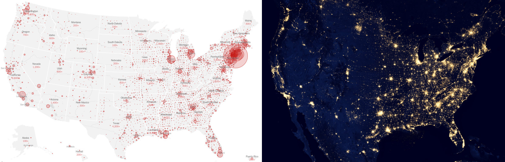
The map at the top of their web page shows how most of the East Coast is covered with cases while much of the mountain states and west has clusters of cases rather than broadly distributed cases. (I thought this map probably looked quite a bit like the US seen from space at night, meaning coronavirus cases are distributed by population density.) You can drill down into each state and see county-by-county data. I’m sure I spent hours working my way through this page and all its data.
I have to admit that I have a love-hate relationship with the New York Times. I read it daily for 20 years but dropped my subscription it in 2003 because its editorial slant had become so obvious and had spilled over into the editorial coverage, polluting it. Their coverage after 9/11 was outstanding and their coverage of the coronavirus is some of their best work in years. They obviously do a good job gathering data and have writers who know their trade. If only they could report news objectively, which is what journalists are supposed to do.
Here’s an example of a subjective headline from the NYT: “Florida Governor, at Long Last, Orders Residents to Stay Home to Avoid Coronavirus. ” The “Long Last” part is what I object to because it is displaying the reporter’s or headline writer’s bias and imposing their perspective on the reader. They could have said: “Florida Governor Among Last to Order….” That would have been more accurate and objective. Readers could then draw their own conclusion about whether it is good or bad that the governor was among the last to issue a stay home order. It is fine if the reporter quotes someone saying “at long last,” but ideally they should present the opposing perspective as well. Far too often, their stories are too one-sided.
Sorry New York Times, while I admire your coronavirus web page, I’m sticking to the Wall Street Journal.


