I’m getting my figures from the map published by the New York Times and updated every few hours. (Be sure to all the way scroll down for other useful charts.) I like it better than the Johns Hopkins map, which shows global figures as well as the number of people who have recovered.
Virus-related deaths also increased, from 86 to 107, an increase of 24 percent. The majority remain in Washington State and are the result of infections the tore through a nursing home, but keep in mind that deaths lag reported cases. Both New York and California are reporting deaths in the double digits.
Washington State continues to see over 100 new cases per day, and cases in New York are soaring even faster. This seems to demonstrate that when the virus gets a grip in your town, it’s going to spread rapidly unless you take immediate measures.
It is difficult to determine if the increased numbers reported above reflect a true growth of the virus or simply reflect the increased availability of test kits. My guess is that both sides of that equation are growing: The virus continues to spread and there are more test kits available.
Hang on folks, it’s going to be a rough ride ahead
Over the weekend, I encouraged everyone to go beyond social distancing and implement a self-imposed quarantine. I’m going to beat that drum again. The life you save could be your own or that of a loved one.
If your job isn’t considered mission critical, stay home and stay healthy. Washing your hands is a good start, but cutting off contact with potential carriers is even better.
Why Quarantine is Important
The graph and its caption below are from a study by the UK’s Imperial College COVID-19 Response Team. You are welcome to read the entire report for yourself, by the key point I’m trying to make is that the big curve of the black line is how many people (per 100,000) get critically ill if we do nothing, and the blue line is what will happen if we do basically everything in our power to keep cases from spreading. In short, only a third as many will be critically ill.
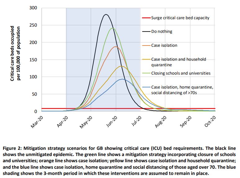
This graph illustrates what the U.S. authorities mean when they say they want to “flatten the curve.” It doesn’t matter that this specific curve applies to the UK; it’s the concept that counts. By closing schools and universities (largely done) by isolating those who are sick (in the works – we have to identify them first and that takes testing), by practicing social distancing, and by quarantining those over 70, we get the best scenario illustrated by the blue line.
My point is why quarantine only those over 70? Quarantine as many as you can. If you can afford to do so and your job isn’t considered mission critical, stay home and stay healthy.
LATE ADDITION: After publication, I ran across this article on ZeroHedge that goes into additional detail on “flattening the curve” and provides a couple of different charts. In their first graphic, be sure to move the blue bar to the left and see how South Korea, Japan and Singapore are outperforming other countries. Well worth reading!


