
Three months ago, predictions that the coronavirus would kill 100,000 or more people caused panic and fear. Today, as we approach 100,000 deaths, there is some finger pointing and blaming, but people seem more worried about when they will be allowed to get a haircut than the loss of 100,000 of their countrymen.
As we wrote on May 10, familiarity with the virus has helped calm our fears, but we are also seeing a virus in retreat, at least in the U.S., and that lends us confidence. Add to that the pent up demand to get back to “normal,” the frustration with months-long confinement, and the appearance of unreasonable and often extreme prohibitions on our constitutional rights by petty bureaucrats and it is no wonder people are protesting and refusing to comply.
The Tale of Two Viruses
It’s also clear that the willingness of people to embrace reopening and how one feels about wearing masks varies in part by how severe the outbreak was in that area. New York City residents – not what one would normally call a bunch of shrinking violets – seem to be accepting lockdown and mask-wearing provisions far more than people in areas with only a fraction of the infection rate. But when you consider than the five boroughs of New York City have more cases than any other state, maybe this isn’t such a surprise.
It only makes sense that people look at the virus and the lockdown measures through the lens of their own experience, and that varies primarily by geography. Just five states – New York, New Jersey, Massachusetts, Illinois, and California, account for about half the cases in the U.S. and more than 56 percent of the deaths. The county of Queens, with 60,960 cases, has more cases in a single county than in 44 states, and with 4,886 deaths, more deaths than in 45 states.
Main Image: The map of the U.S., above, published by Justin Hart on Twitter (@justin_hart), shows that a third of the country’s VOVID-19 deaths took place in those are in red, a third in those in yellow, and the final third across the remainder of the country. The impact of the virus has varied across the country and we should be basing our reopening plans on local information
Today’s Numbers
Reported cases of COVID-19 in the U.S. rose to 1,690,500, an increase of 20,400 or 1.2 percent in the past 24 hours. Deaths climbed 825 to 99,016, or less than 1 percent.
Globally, there were 69,000 new cases reported, bringing the total to 5.618 million. Deaths rose to 351,160.
Yesterday, we provided an update on whether the virus was considered increasing, steady or falling from the New York Times. Today, we are providing state-by-state data that compares numbers from a week ago with numbers as of this morning:
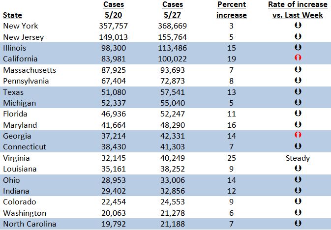
Once again we see that reopening has not yet had a significant impact on the growth rates of coronavirus. A week ago, these numbers were up in three states; today they are up in only two.
This chart and the numbers above show it the two faces of the coronavirus in the U.S. In states, we have double digit growth; while in others only single. In some states, we’ve had hundreds of thousands of cases; in others only a fraction of that.
This is why there is no single national answer for how to handle COVID-19. This is why New Yorkers are outraged at people in Missouri packing pools over Memorial Day while people in Missouri, with only 12,437 cases and 698 deaths wonder what the big deal is.
To put today’s chart and other data in perspective, you can look at last week’s data or data from a month ago when cases were first beginning to level off.


